Mapping human disease

 I’ve been on a space kick lately, ever since I got a telescope for my birthday and looked up close at the moon for the first time in my life.
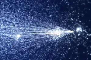
So the image on the left calls to my mind nebulae and distant galaxies…a sort of map of the universe, that infinitely large entity.
But in fact it’s a map of the microscopically small human cell. Doesn’t look a lot like the cell “maps” we’re used to though, does it? Instead of showing the location of the nucleus or the mitochondria, this map shows the genes that make up such bodies and the connections between them.
In a TEDmed talk earlier this year, physics professor Albert-László Barabási used this and other visualizations developed by research professor Mauro Martino to explain how the network of human genes is like the network of streets in Manhattan, and how mapping that network may eventually allow us to identify the clusters relevant to individual diseases the same way we can find a hub of art galleries or theaters in the Big Apple.
Here is the video of Mauro’s visualization and below it you’ll find Barabási’s talk.


