Will the first VP debate tell us more about the 2020 election than Trump and Biden’s?

On Wednesday, Vice President Mike Pence and Democratic nominee Sen. Kamala Harris will face off in a debate that might be more substantial than the presidential matchup the week prior.
Where will the two vice presidential candidates differ in their policies? How will they interact with one another?

Michelle Borkin, an assistant professor in the Khoury College of Computer Sciences at Northeastern. Photo courtesy Michelle Borkin
Michelle Borkin, an assistant professor in the Khoury College of Computer Sciences at Northeastern University, and her doctoral student, Laura South, have a new way to answer these questions and distill the often unwieldy debates into coherent, easy-to-access information: an online tool called DebateVis.
The project was created by an interdisciplinary team of researchers at Northeastern following a two-year-long study of argument structure and text summarization—the process of creating short, accurate, and fluent summaries of longer text documents.
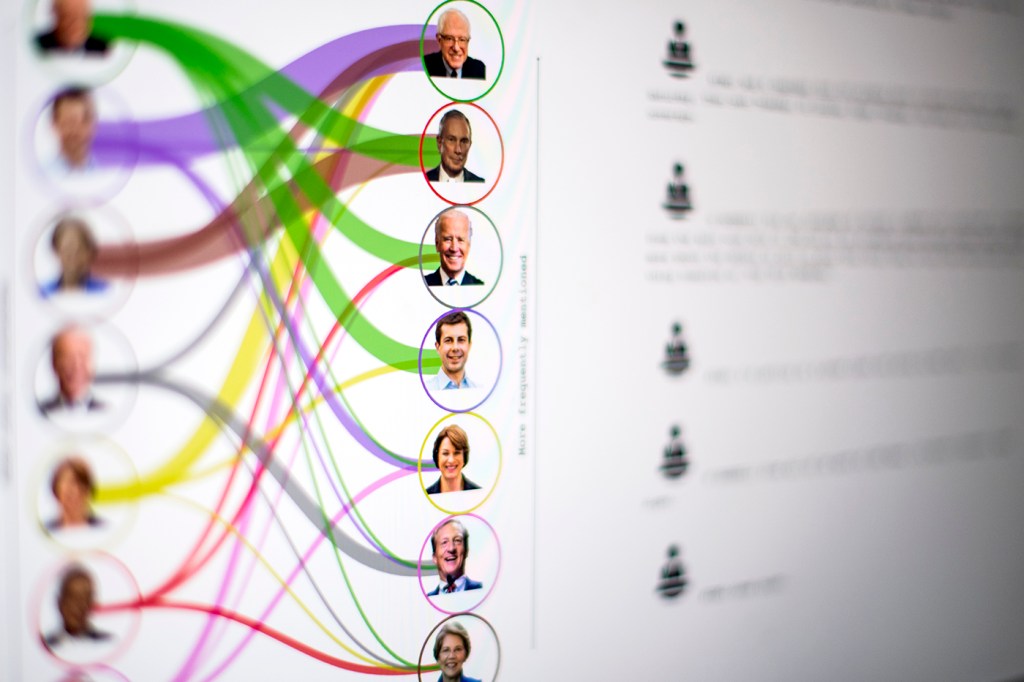
Rather than repeating soundbites and Twitter hot-takes, DebateVis downloads the entire debate and mines it for relevant information to help voters compare the candidates on a substantive level.
The tool’s website displays three sections. In the middle, visitors can scroll through a full transcript of the debate. On the left, they can track the number of times each candidate mentions a topic or the name of an opponent. To the right, a timeline shows when the different topics came up for discussion. When readers click on a topic, such as climate change or education, the tool directs them to the relevant sections of the transcript. Audience reactions are also marked.
Borkin and South initially rolled out the website for the 2016 debates. They’ve re-launched the site for this year’s debates ahead of the Nov. 3 election.
“With the elections coming up, we felt it was really important to educate the public and to have tools out there to make information accessible and clear,” Borkin says.

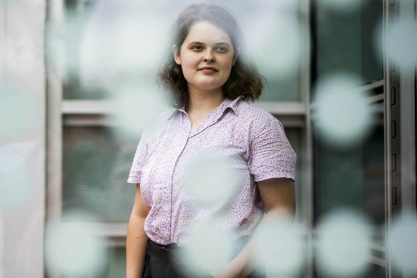
Northeastern student Laura South studies computer science. Photo by Matthew Modoono/Northeastern University
During the first presidential debate on Sept. 29, the researchers paid close attention to topics and interactions. Later that evening, using a Python script—an open-source programming language—South created visualizations for DebateVis by picking out the topics from a transcript.
Their findings confirmed what many viewers had witnessed: The much-anticipated face-off between the contenders was largely devoid of substance.
“One of the main takeaways I got from looking at our visualization of the debate is just how little debating there was [last] Tuesday,” says Borkin. “Much of our algorithm lay quiet because so much of the evening did not include substantive conversations and arguments about policy, but rather petty conversations with no substance.”
South says that for the casual time-constrained viewer looking for recaps of debates, DebateVis offers a visual alternative to soundbites. And the visualizations may offer political junkies broader policy insights about the candidates.
“Someone who was able to watch the debate and is active and interested in keeping up with the political debates still might not be able to fully analyze the higher level patterns that are occurring,” she says. “It’s hard to see recurring patterns when you’re just sitting and watching it from start to finish.”
After the election, the team of researchers (which includes Michail Schwab, Lu Wang, Nick Beauchamp, John Wihbey and Aleszu Bajak) plans to evaluate the kind of impact the website had and examine how much of a difference it made.
Creating an informed citizenry is the researchers’ ultimate goal, says Borkin. The data visualizations are meant to equip citizens with the tools and knowledge they need to make informed decisions on issues and candidates.
“Initially it was ‘how do we visualize the debate?’ But once we got into thinking about this, it was ‘we want an informed electorate,’” she says. “This is just our little tiny contribution to that.”
South says more action needs to be taken to make data visualization accessible and useful for people who historically have been marginalized or kept out of positions of power.
“I view visualization as a tool for democratization in some ways,” she says. “I think that it has the potential to give at least some power back to the people who maybe would be otherwise very distanced from this data that is about their lives and impacting their lives.”
For media inquiries, please contact Shannon Nargi at s.nargi@northeastern.edu or 617-373-5718.


