Graphic art lessons for scientists

Last week’s Meet the Author lecture at Snell Library featured science photographer Felice Frankel of MIT. The lecture was connected to the Places and Spaces exhibit currently on display on Snell’s first and second floors.
Places and Spaces opened my eyes to an entire way of thinking that I hadn’t previously considered. And as you may have noticed, I’ve become kind of obsessed with how people communicate data to a lay audience using visual tools.
And while Frankel’s talk was about science visualization, she came at it from an entirely different perspective. In their new book, Visual Strategies, Frankel and her co-author Angela DePace present scientists with a visual toolkit for representing data and results in their own scholarly work — research articles, posters, you name it.
“It’s a handbook for scientists and engineers to get them to think about their work,” she said. When someone becomes entrenched in their work, it’s difficult to imagine how someone on the outside will perceive it, she continued. “Their eye goes directly to what they want you to see and the assume you see it, too.”
I used to be a writing-workshop-alholic. A frequent topic of conversation, regardless of the group, was which details to include and which to exclude. Sometimes writers do this same thing that Frankel described: when we know so much about our topic or our characters, for example, we can forget to include crucial details to bring the reader into the loop.
She presented three questions for scientists to ask themselves when putting together a graphic intended to support the science. First, what is the first thing you want your viewers to see? Second, is this an explanatory or an exploratory graphic? And third, what is your graphic about?
The tools we have to adress these questions, the authors decided after long debates, are composition, abstraction, color, layering, and refinement.
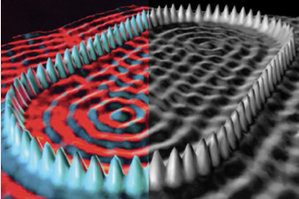
As an example, she presented this iconic quantum mechanics image from IBM. It’s a corral of individual atoms.
 This is how IBM represented it originally in a 1993 article in Science Magazine. When you look at this, where does your eye go first? Mine goes to the ring of blue spikes, or atoms.
The field around the corral is flattened out by virtue of its multicolored rendering and by that striking blue ring.
But apparently the most interesting thing about this image, to a quantum physicist anyway, is the effect on the quantum field of that ring…not the ring itself.
In this case, Frankel explained that the use of color significantly diminishes the message the scientists are trying to deliver. Her response was somewhat counter-intuitive to me: the graphic artist decided to remove the color entirely, expanding (not reducing) it into a black and white image:
 This time where does your eye go. Okay, admittedly the ring of atoms still stands out, but now the ripples in the quantum field are also quite prominent.
“Pay attention to your use of color,” she said. “Make it more readable.”
Later in the talk she touched on big data — that is the exploding information stream made possible now by things like mobile and satellite devices and the supercomputers that can make sense of it all.
The science maps in Places and Spaces are static representations of these massive data sets. The attempt to make big data legible, digestible. The works in Isabelle Meirelles’ exhibition in Florida have that same intention. And while 2D posters are perhaps the simplest and least expensive way to get the information out there, an entire world of information is lost in this approach. Many of the works in Meirelles’ exhibit connect to an online component that users can interact with.
And this is where Frankel’s point, comes in. “Graphics and publishing are changing,” she said. New forms of data representation can “enable users to make decisions about what they want to see.” Whereas the works in Meirelles’ show allow users outside the field to understand through interaction, Frankel suggests that scientists can use these interactive media tools as well, to communicate their results to colleagues.


